
Skins
A skin is how the mini player’s UI itself gets replaced — fully rebuilt: your own layout, your own controls, your own visualizer, anything with real logic. mount(container, amee) is handed an empty <div> and the full window.amee SDK — album art, transport controls, seek, volume/mute, timing, the audio visualizer’s spectrum data — and can build whatever UI it wants on top.
This replaces what used to be a separate “plugin” system that could only add a small bolt-on widget after a fixed built-in layout. A skin owns the whole mini player instead — including Amee’s own default UI, which ships as an ordinary skin (classic, see Worked example) rather than special-cased app code.
Security model — read this first
Section titled “Security model — read this first”Skins run with the exact same privileges as Amee itself. There is no sandbox: a skin’s JavaScript executes in the same window, with the same access to every one of Amee’s own internal capabilities (including skin management), the same DOM, and the same network access as the rest of the app. A skin could, in principle, read your now-playing history, make arbitrary network requests, or misuse whatever OS permissions Amee has been granted (it already requests system-audio access for the visualizer).
This is a deliberate, explicit trade-off in favor of maximum flexibility for skin authors, made with that risk understood — not an oversight. Installing a skin only validates the package’s shape (does manifest.json parse, does the declared entry file exist, are the declared dimensions sane); it makes no attempt to verify a skin’s JavaScript is safe, because that’s not something a file-format check can do.
Only install a skin from a developer you trust, the same way you’d think about installing a browser extension.
What a skin is
Section titled “What a skin is”A directory containing:
-
manifest.jsonat the root — the manifest:{"id": "my-skin","name": "My Skin","author": "your-name","description": "One line describing it.","version": "1.0.0","entry": "main.js","width": 420,"height": 84,"resizable": true,"min_width": 360,"max_width": 900}idandnameare required.entrydefaults tomain.jsand must be a plain filename — no/or..— sitting at the package root (assets like CSS/images/fonts can live in subfolders; the JS entry point itself can’t).width/heightare the mini player window’s desired size, in logical pixels (80–2000 each) — the window is resized to match whenever this skin becomes active.content_height(optional, defaults toheight— no reserved space) lets you declare a taller window than your actual content needs, split evenly into blank space above and below it. Center your content vertically (display: flex; flex-direction: column; justify-content: centerworks well) and that reserved space is yours to pop something into — an expanding control, a slider, anything — using CSS alone, with no runtime window move/resize call needed at all. Seeclassic’s volume flyout for a worked example. This sidesteps the timing gotcha below entirely, at the cost of the window always taking up that reserved screen real estate (invisible, but still there — clicks in it are passed through to whatever’s behind the window automatically, so it doesn’t block anything underneath).resizable(optional, defaultfalse) opts the mini-player window out of being fixed-size:truelets the user drag-resize it,"skin"lets only your own code resize it viaamee.resizeWindow()— see Resizable windows below.graceful_shutdown(optional, defaultfalse) opts into a chance to run cleanup or a fade-out animation before Amee actually quits — see Graceful shutdown below.pip_dock_edge/pip_dock_align/pip_dock_gap(all optional) choose which edge of the browser’s Picture-in-Picture window the mini player attaches to — see Docking to Picture-in-Picture below. -
The entry file (
main.jsby default) — an ES module exportingmount(container, amee):containeris a plain, empty<div>filling the mini player window;ameeis the SDK.mountmay return a cleanup function, called when the skin is switched away from. -
Optionally, any other files your skin needs (CSS, images, fonts) — read them at runtime via
amee.getSkinAsset(path).
No build step, no bundler, no framework required — plain DOM APIs work fine, and that’s what the bundled classic skin uses.
Resizable windows
Section titled “Resizable windows”By default the mini player is a fixed-size window — a skin declares width/height and that’s what it always is. resizable in manifest.json opens that up, within bounds you control:
resizable |
The user can drag the edges | You can call amee.resizeWindow() |
|---|---|---|
false (default) |
no | no |
true |
yes | yes |
"skin" |
no | yes |
Reach for "skin" when you compute the size — sizing yourself against the browser’s Picture-in-Picture window, say. Under true the user can drag a size that your next resizeWindow() call overwrites, and theirs is the one that gets remembered for next launch; "skin" removes the drag handles so there’s only one answer.
{ "resizable": true, "min_width": 360, "max_width": 900, "min_height": 520, "max_height": 520}min_width/min_height/max_width/max_height are all optional (each falls back to the global 80–2000 logical-pixel bounds) and are only accepted when resizable is true or "skin". Pin min_height/max_height equal to height (as classic does) to allow horizontal-only resizing — this is required if your manifest also sets content_height, since that reserved-space math is derived from height as a fixed value and would go stale against a live-resized one.
Set your own size with amee.resizeWindow(width, height). It’s absolute, in logical px, clamped to your manifest’s min/max, and it resolves with the size that was actually applied once the native frame change has landed — lay out for the resolved value, not for what you asked for, and apply any compensating CSS after the await. The window grows away from whichever screen edge it’s near; while docked to a Picture-in-Picture window it grows away from the video, so the docked edge stays put and the mini player re-docks itself around the new size. Two things to know: it rejects while a flyout is expanded (collapseWindowFlyout() first), and with Accessibility control granted Amee holds a docked pair together by moving the video, so a resize nudges the user’s video rather than the pill — resize on real layout changes, not on every track.
Give the size back with amee.resetWindowSize() when your mode ends. It drops your override and puts the window back to whatever the user chose by dragging — or your manifest’s width/height if they never did — resolving with the size it landed on. That resolved value is the only way to learn the user’s own choice, since it isn’t otherwise readable from a skin.
amee.forgetWindowSize() goes one rung further, dropping the user’s drag-chosen size as well so the window lands on your manifest’s own width/height. Keep it for a “reset this skin’s settings” action. A mode ending must use resetWindowSize(): the drag is a number the user chose, and helping yourself to it leaves them nothing to undo.
Only the user’s own drag-resized size is persisted. A size your skin sets is a runtime value: it survives until you reset it, the skin is switched away, or its package is updated, and never overwrites what the user chose by dragging. The user’s size is remembered across app restarts and across switching to another skin and back — you don’t need to do anything for this; it’s handled entirely by the core app, the same way window position already is. If your manifest’s own bounds later change (a skin update lowers max_width, say), a previously-saved size is clamped back into range rather than discarded.
Reflow your own layout with amee.onResize(callback) — fires immediately with the current content-area size, then again on every resize, in the same CSS-px units you already style in. A skin that ignores it still works (the window just resizes around an unchanged-size UI, gaining/losing dead space), but adapting is usually a couple of CSS rules plus recomputing anything that depends on measured widths.
Graceful shutdown
Section titled “Graceful shutdown”By default, quitting Amee closes the mini player instantly — no chance for your skin to react. Setting graceful_shutdown: true in manifest.json opts in to a signal-then-wait sequence instead:
{ "graceful_shutdown": true, "graceful_shutdown_timeout_ms": 400}Register a callback with amee.onShutdown(cb) (typically in mount(), alongside your other subscriptions):
amee.onShutdown(async () => { root.classList.add("fading-out"); // CSS opacity transition await new Promise((resolve) => setTimeout(resolve, 300));});When the user quits, Amee runs every registered onShutdown callback and waits for them all to settle before actually exiting — but only for up to graceful_shutdown_timeout_ms (optional, defaults to 1500ms if omitted, clamped to 100–10000ms). This is best-effort, not a guarantee: Amee force-quits once that timeout elapses regardless of whether your callback has finished, so a hung or slow callback can never block quitting. Treat it as “a little room for a fade-out or a final save,” not a place to do anything that must complete.
A skin that doesn’t set graceful_shutdown (every skin written before this feature existed) is completely unaffected — quit stays instant, exactly as before.
Docking to Picture-in-Picture
Section titled “Docking to Picture-in-Picture”When the user pops a video out of Chrome or Edge into a Picture-in-Picture window, Amee can attach the mini player to it and follow it around the screen. Which edge it attaches to is your call, not the user’s — only you know what your artwork looks like, and a pill designed to sit under a video reads wrong hanging off its left side.
Which window actually moves is the user’s call, not yours: with their Let the
mini player drag the video window setting on, the mini player stays put and the
video is moved to the edge you asked for instead. Nothing changes for your
skin either way — but note that edge in the status below is the edge you
configured, and Amee may flip it to the opposite one when the position you
asked for would land off-screen.
{ "pip_dock_edge": "bottom", "pip_dock_align": "center", "pip_dock_gap": 8}| Key | Values | Default |
|---|---|---|
pip_dock_edge |
"top", "bottom", "left", "right", "none" |
"bottom" |
pip_dock_align |
"start", "center", "end" |
"center" |
pip_dock_gap |
0–200 logical px | 8 |
All three are optional, so a skin written before this existed docks below the
video and centred without being republished. "none" opts out entirely, for a
skin that positions itself and should never be moved. pip_dock_align and
pip_dock_gap are rejected alongside "none" — they would mean nothing.
align applies to the axis the edge doesn’t pin: horizontal for a top/bottom
dock, vertical for a left/right one. Note that a Picture-in-Picture window can
be narrower than your skin (Chromium’s floor is 284px), in which case center
puts you slightly outside the video’s edges on both sides — that is correct,
and start/end still mean “flush with that edge of the video”.
The gap is measured to your visible content, not to your window. If your
manifest declares content_height, the reserved dead-space band is discounted,
so an 8px gap looks like 8px regardless of how much invisible padding your
window carries. This matches how snap_mini_player puts content — not window
bounds — flush against a screen edge. There is no content_width, so on the
left and right edges the gap is measured to the window box on the horizontal
axis.
Docking needs the Amee browser extension. Chromium drops out of the system now-playing session the instant a video pops out, so without the extension Amee cannot tell what the floating window is showing, and deliberately will not attach to it. The user can also turn docking off entirely in Settings.
Knowing whether you are docked
Section titled “Knowing whether you are docked”const { docked, edge } = await amee.getPipDock();amee.onPipDockChange(({ docked, edge }) => { /* re-lay out */ });getPipDock() answers four separate questions, and a skin offering a dock
button needs all of them:
| Field | Question |
|---|---|
availability |
Can this work here at all? "ok", or which of "disabled" / "integration_off" / "no_extension" to explain |
pip_open |
Is a video popped out right now? |
docked |
Is the pill attached to it? |
snapping |
Would letting go of the drag in progress attach it? |
There’s a fifth, browser_signal, for a different question: whether browser
information reaches Amee at all, ignoring the user’s docking switch. It never
says "disabled". Reach for it when you want to explain the plumbing rather
than the feature — with docking off, availability says "disabled" and tells
you nothing about whether the extension is even connected.
availability is about configuration, not the moment: it stays "ok" with no
video open. Treat a value you do not recognise as not-usable — the list may
grow. pip_open and docked differ exactly when the user has dragged the pill
away, which is when a re-attach button earns its place.
let ui = null;amee.onPipDockChange((s) => { const canReattach = s.availability === "ok" && s.pip_open && !s.docked; button.hidden = s.availability !== "ok"; button.disabled = !canReattach; button.title = { ok: "Attach to the video", disabled: "Turn on Dock to Picture-in-Picture in Settings", integration_off: "Turn on browser media in Settings \u2192 Extension", no_extension: "Install the Amee browser extension", }[s.availability];});button.onclick = () => amee.dockToPip().catch((e) => console.error(e));onPipDockChange fires once with the current status shortly after you
subscribe, so there is no need to call getPipDock() first to seed your UI —
and a skin that remounts (the Reload button, a reloaded webview) picks the
state back up on its own.
snapping is the one that needs rendering during a drag: it is true only while
the user is dragging the pill and letting go would re-attach it. “Dragging”
means the window has actually moved, not merely that a button is held — a click
on one of your own controls leaves it false throughout, so you don’t have to
suppress it yourself.
Render something while snapping is on. Docking is magnetic — drag the
pill away to detach, drag it back to re-attach — and that is completely
invisible while it happens, because the only feedback is the pill snapping into
place after the pointer is already up. Without a cue the user either guesses
right the first time or never learns the behaviour exists. classic puts an
accent ring around the pill (.mini-player--snapping).
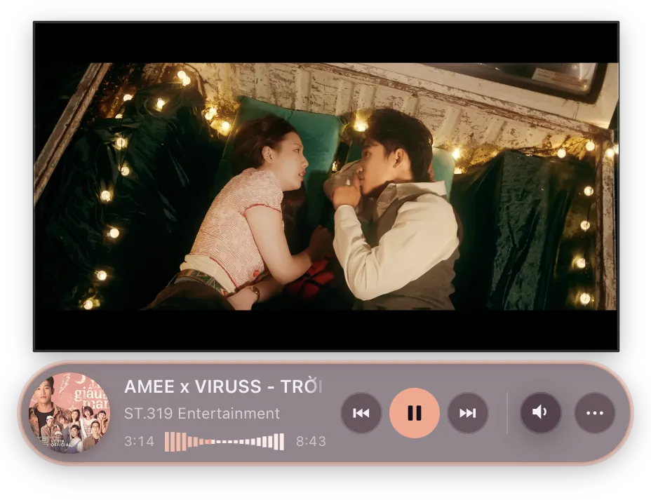
Both are also worth reading if your skin grows anything past its own content — a flyout, a popover, an expanding control. Docked below a video, the space above your content sits on top of the video; docked above one, the space below does.
The mini player is always drawn above the Picture-in-Picture window, so a flyout that reaches across the video is visible rather than hidden behind it — you are choosing between tidy and untidy, not between working and broken.
Weigh that against screen room, and let screen room win. The two pull opposite
ways in the most common arrangement there is: a video parked low on the screen
with the pill underneath, where the space to open downward is already past the
bottom of the display. A flyout over the video is untidy for as long as the
pointer rests there; one off the edge of the screen cannot be used at all.
classic deliberately does not consult the dock for this — it picks purely
on available screen space, which already avoids the video whenever there is
room on the other side.
Changing dock at runtime
Section titled “Changing dock at runtime”await amee.setPipDock({ edge: "top" }); // overrideawait amee.setPipDock(null); // back to the manifestMerges field by field, so the call above keeps whatever pip_dock_gap your
manifest declared. Not persisted, and dropped when the user switches skins.
Declare your resting dock in the manifest and call this only when you change
modes. The manifest is read off disk before your first frame, so the mini
player lands in the right place with no visible jump; setPipDock is a round
trip late by construction. It is here for a skin that switches between a
compact and an expanded layout and wants to re-dock as it does.
Closing the video’s Picture-in-Picture window
Section titled “Closing the video’s Picture-in-Picture window”The PiP window carries its own Back to tab button, which does two things: closes the window, and jumps to the tab. Both halves are available separately.
await amee.exitPictureInPicture?.(); // close the windowawait amee.focusNowPlayingTab?.(); // and/or go to the tabCall both to reproduce the browser’s button. Call the first alone to dismiss the window without dragging the user into the browser — usually what someone listening to music actually wants.
Gate it on the now-playing payload; every prerequisite is already in there:
const canClose = nowPlaying.source === "extension" && nowPlaying.picture_in_picture;source === "extension" covers the rest by itself: with the extension unpaired,
or browser media switched off in Settings, the extension is never the source.
Do not gate this on PipDockStatus. It answers a different question —
pip_open means Amee located and pinned the window in order to dock to it,
and availability additionally requires the docking setting to be on. Closing a
PiP window needs neither, so a skin that checks those hides a control that would
have worked.
There is no matching “pop this video out”, and the asymmetry is the web platform’s rather than Amee’s: entering Picture-in-Picture requires a real user gesture inside the page, which nothing outside the browser can supply. Leaving requires none. Measured, not assumed.
Packaging as .ybskin
Section titled “Packaging as .ybskin”Distribute your skin directory as a .ybskin file — a zip archive with manifest.json at its root, renamed with a .ybskin extension. Nothing more exotic than that:
cd my-skin/zip -r ../my-skin.ybskin .On import, Amee extracts it to its own app-data directory and keeps a copy of the original archive so it can hand back an identical file later via Export.
Speaking the user’s language
Section titled “Speaking the user’s language”Amee resolves a language for itself — from the user’s pick in Settings, or from the OS — and amee.getLocale() reports it as a base tag ("en", "vi").
Ship one JSON file per language under locales/ in your package and load the one that applies:
async function loadStrings(amee) { const wanted = amee.getLocale?.() ?? "en"; for (const candidate of [wanted, wanted.split("-")[0], "en"]) { try { const uri = await amee.getSkinAsset(`locales/${candidate}.json`); // fetch, not atob — see below. return await fetch(uri).then((r) => r.json()); } catch { // No catalogue for that tag; try the next candidate. } } return {};}There is no way to list your own files, so either probe-and-catch like this or hardcode the languages you ship. Nothing checks that a catalogue exists or that two catalogues agree — falling back is your job.
Subscribe with amee.onLocaleChange?.(...) to re-render when the user picks a different language. It also fires once on subscribe, so you can use one code path for the first render and every later one. If your skin caches labels on elements it builds once, relabel those by hand — and if you have a render fast path keyed on now-playing state, a language change doesn’t touch that key, so invalidate it.
getLocale() is Amee’s answer, not an instruction. To offer a language of your own, store the choice in amee.storage and read that instead, falling back to getLocale() for a “follow Amee” option — classic does this in its About window.
Extra windows and per-skin storage
Section titled “Extra windows and per-skin storage”Your mount(container, amee) entry owns the mini player, but nothing stops your skin from having other windows too — a settings form, an about panel, an equalizer, a lyrics view, whatever you want. There’s no fixed set of window “kinds” and no separate API per use case: amee.openSkinWindow(entry, options) opens any JS file in your own package as its own normal, decorated, resizable window, as long as that file exports mount(container, amee) — exactly the same contract as your main entry.
document.querySelector(".gear-icon").addEventListener("click", () => { amee.openSkinWindow("settings.js", { title: "My Skin Settings", width: 320, height: 240 });});// settings.js — a second entry file in the same package, next to manifest.jsonexport function mount(container, amee) { const input = document.createElement("input"); input.type = "color"; amee.storage.get("accentColor").then((saved) => { input.value = saved ?? "#8b7cff"; }); input.addEventListener("input", () => amee.storage.set("accentColor", input.value)); container.append(input);}Calling openSkinWindow("settings.js", ...) again while that window is still open focuses it instead of opening a second one — safe to wire straight to a button with no open/already-open bookkeeping of your own.
amee.storage is how state gets shared back to your main mount (or any other window you’ve opened): one JSON value per key, scoped to your skin, persisted by Amee — the schema inside is entirely up to you.
SkinWindowOptions is { title?, width?, height?, minWidth?, minHeight?, resizable? } — all optional; unset dimensions fall back to a reasonable default.
Worked example
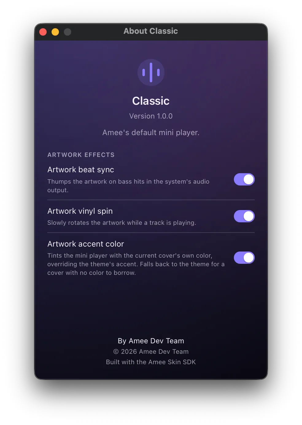
Section titled “Worked example”Amee’s own default mini player, classic, is a real skin — not special-cased app code. It’s a complete example covering everything in this document: artwork + metadata, a click-to-seek progress bar, transport controls, and volume/mute, in about 200 lines of plain DOM manipulation. Its “…” menu’s “About Classic” row also doubles as a worked example of Extra windows: it reads its own manifest live via getSkinAsset to show name/version/description/author without hardcoding any of it.
Installing a skin
Section titled “Installing a skin”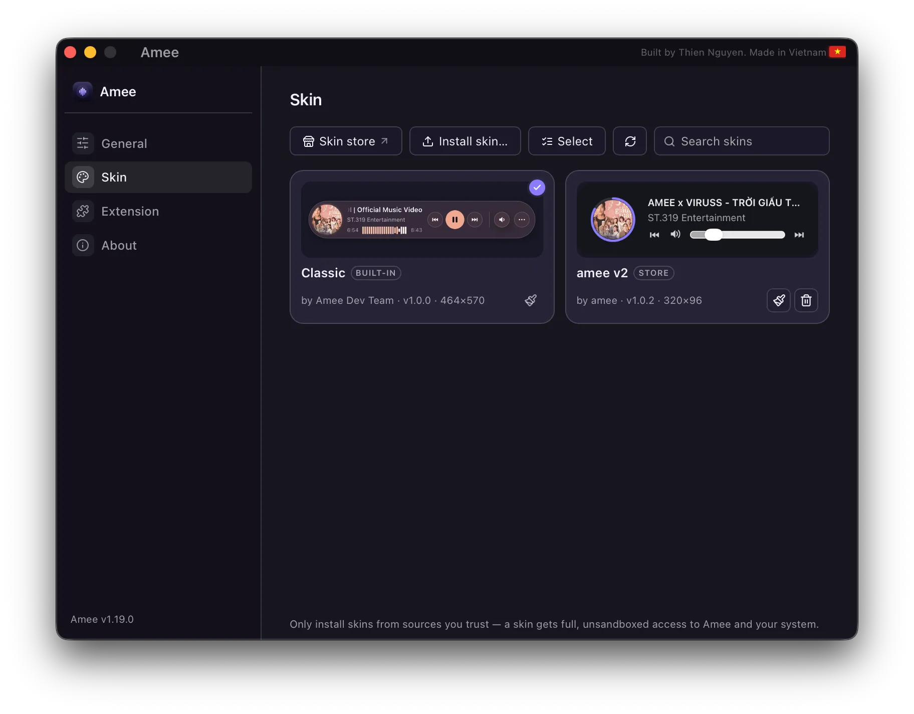
Everything below lives in Dashboard → Skin.
From the skin store. amee.thiennguyen.dev/store is the public registry of published skins, linked from the Skin tab’s toolbar and from its empty state. Its Install in Amee button hands Amee a download plus a digest, Amee verifies the archive before opening it, and then shows a consent window describing what’s actually inside — the name, version and author come from the verified package, never from the link. Approve it and the skin installs. A store-installed skin wears a Store badge and keeps a record of where it came from.
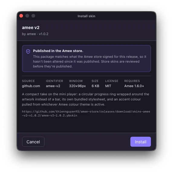
If the deep link doesn’t work for you, the store page’s Download .ybskin button gets you the same file to install by hand.
From a file. Install skin…, pick your .ybskin file — or drag it onto the Dashboard window, any tab. It’s extracted, validated, and installed immediately; activate it from the same panel to see it live in the mini player, no restart needed.
Updating. Skins installed from the store are checked against the store’s signed index — one request covers every installed skin — and a newer version shows up as an Update button on that skin’s card. The refresh button in the toolbar checks on demand. Skins you sideloaded and the built-in classic have no store entry to compare against, so they’re never offered updates.
Only classic ships built-in, and it can’t be deleted; anything you install yourself can be removed again from the same panel, individually or by selecting several. Reveal in Finder opens the directory where installed skins are stored.
Publishing
Section titled “Publishing”Publishing to the store is a pull request against amee-store: you commit the skin’s source plus a small store.json and a preview image, and CI validates the package, builds the .ybskin, and attaches it to a release. Publish a higher version later and every copy of Amee that installed it from the store sees an update offer — there’s no separate feed to maintain.
Publishing is a reviewed PR plus automated validation of the package’s shape. It is not a judgement that the JavaScript is safe, and a store skin runs with exactly the same unsandboxed access as any other — the security model at the top of this page applies to store skins unchanged.
Design notes
Section titled “Design notes”- Why replace the old plugin system? The original design only let a “plugin” add a small bolt-on widget after a fixed built-in layout. That didn’t match what developers actually wanted: the ability to build the mini player’s entire interface — their own layout, their own controls — packaged and installable. Skins are the full-power successor to that old plugin system.
- Why full trust instead of a sandbox? A sandboxed model (an isolated iframe talking to the host only through a narrow, curated message-passing API) is the safer default for community-contributed code, and was considered — it’s what this project would recommend if starting from a blank slate with untrusted contributors in mind. Amee deliberately chose full trust instead, for maximum flexibility, with the risk understood. If that trade-off ever needs revisiting, the sandboxed model is the natural next step, and wouldn’t require skin authors to change anything about the
mount(container, amee)contract — only howcontainerandameeare actually wired up under the hood. - Why a zip instead of a single file? A skin that owns the whole UI often needs more than one file — custom fonts, images, a separate stylesheet — which a single-file plugin format couldn’t accommodate. A zip is the simplest container that supports that without inventing a new packaging format.
- Why can a skin resize the window but not the entry filename’s location? Window size is a genuine per-skin design choice (a skin built around large album art needs more room than a slim pill). Restricting the entry file to the package root is just to keep path resolution trivial and safe — nested assets don’t have that restriction.
Next: the SDK reference
Section titled “Next: the SDK reference”See the window.amee SDK reference for every method, event, and gotcha available to skin code.